Marketplace was a B2B application, designed for Data practitioner’s and Data scientists at the bank. I created sketches, wireframes, and both low and high fidelity mockups, along with clickable prototypes for new features like landing pages, forms, dashboards, and chatbots. The team consisted of a product owner, UI and UX leads, and developers, collaborating in an agile environment, to deliver 2 week sprints.
Through usability testing and iterative design, I improved the user experience and contributed to the design system’s evolution for consistency and accessibility. I delivered compelling visual designs and UI elements, balancing user experience and business goals, improving product quality, and increasing user engagement.
Role:
- UI/UX
- Product Design
- Visual Design
- Wireframing & Prototyping
- User Testing
- Interaction design
Tools:
- Pencil & Paper
- Figma
- Jira Boards
- Miro
A one-stop-shop to search and discover data across the bank
Marketplace was a B2B application, designed for Data practitioner’s and Data scientists at the bank. I created sketches, wireframes, and both low and high fidelity mockups, along with clickable prototypes for new features like landing pages, forms, dashboards, and chatbots. The team consisted of a product owner, UI and UX leads, and developers, collaborating in an agile environment, to deliver 2 week sprints.
Through usability testing and iterative design, I improved the user experience and contributed to the design system’s evolution for consistency and accessibility. I delivered compelling visual designs and UI elements, balancing user experience and business goals, improving product quality, and increasing user engagement.
My Role
- UI/UX
- Product Design
- Visual Design
- Wireframing & Prototyping
- User Testing
- Interaction design
Tools
- Pencil & Paper
- Figma
- Jira Boards
- Miro
SEEING RESULTS
After launching the MVP, we saw strong early results. Users completed key tasks more efficiently and expressed excitement about the streamlined experience, especially the removal of cumbersome navigation across multiple products. These outcomes validated our user-centered approach and informed priorities for the next phase.
700
Unique Monthly
Visitors
8 min
Average Time Spent on Platform
30%
decrease in time to locate data
90%
Post-Survey Satisfaction Rate
01 Discover: Understanding the problem space
The Problem:
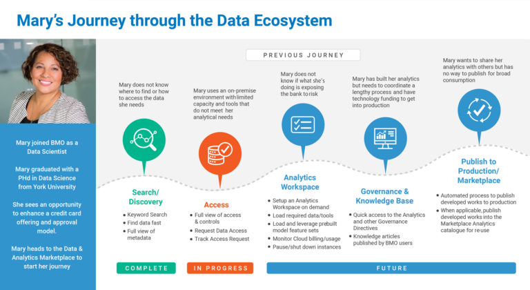
There’s a lack of visibility into Data and Analytics assets across the bank. Searching for data is time-consuming and inefficient, often requiring users to navigate multiple systems. Even when data is found, users struggle to assess its quality, credibility, and relevance — leading to rework and delays.
Mary’s end-to-end experience — from needing data for a report to actually using it — highlighted several breakdowns in the current process:
- Excessive time spent locating relevant datasets, often jumping between systems or reaching out to colleagues.
- Uncertainty around data ownership and definitions, leading to misinterpretation and rework.
- Lack of trust in data quality, which caused her to second-guess findings and seek manual confirmation.
- No centralized view of available assets or quality indicators.
Product Feature Roadmap:
Mary’s journey helped us prioritize the most impactful product features for the next phase:
-
Improved data search and filtering capabilities, including tagging, categorization, and metadata visibility.
-
Built-in data quality indicators and certification badges, so users can quickly assess reliability.
-
Ownership and contact attribution for datasets, giving users a clear escalation or clarification path.
-
A unified data catalog interface, centralizing access and visibility across data platforms.
These insights moved us from assumption-based planning to user-validated roadmap decisions. By centering real user struggles, we ensured that upcoming features would solve meaningful problems and drive adoption across teams.

Research Approach:
In close partnership with the UX Lead, I played a key role in integrating user insights throughout the design process. I led and facilitated user research activities including: interviews, surveys, A/B testing, and usability sessions to capture both qualitative and quantitative feedback.
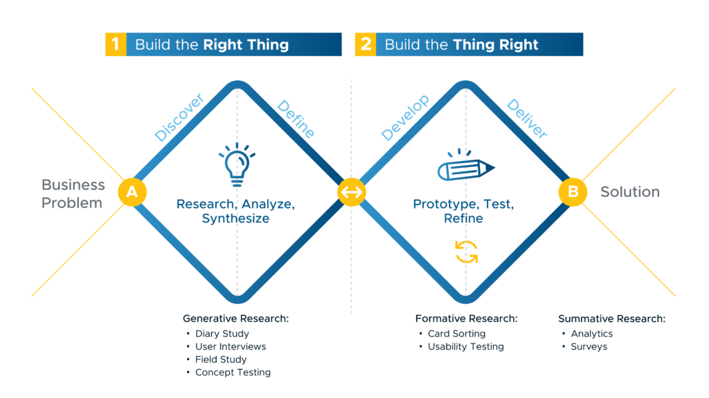
I helped synthesize findings into actionable insights, collaborated on prioritizing them based on impact, and translated critical feedback directly into iterative design improvements. This hands-on approach allowed us to continuously refine the experience, ensuring the product met user needs, improved overall usability, and stayed aligned with business and technical goals. The visual below outlines our collaborative process.
Research Approach:
In close partnership with the UX Lead, I played a key role in integrating user insights throughout the design process. I led and facilitated user research activities including: interviews, surveys, A/B testing, and usability sessions to capture both qualitative and quantitative feedback.
I helped synthesize findings into actionable insights, collaborated on prioritizing them based on impact, and translated critical feedback directly into iterative design improvements. This hands-on approach allowed us to continuously refine the experience, ensuring the product met user needs, improved overall usability, and stayed aligned with business and technical goals. The visual below outlines our collaborative process.

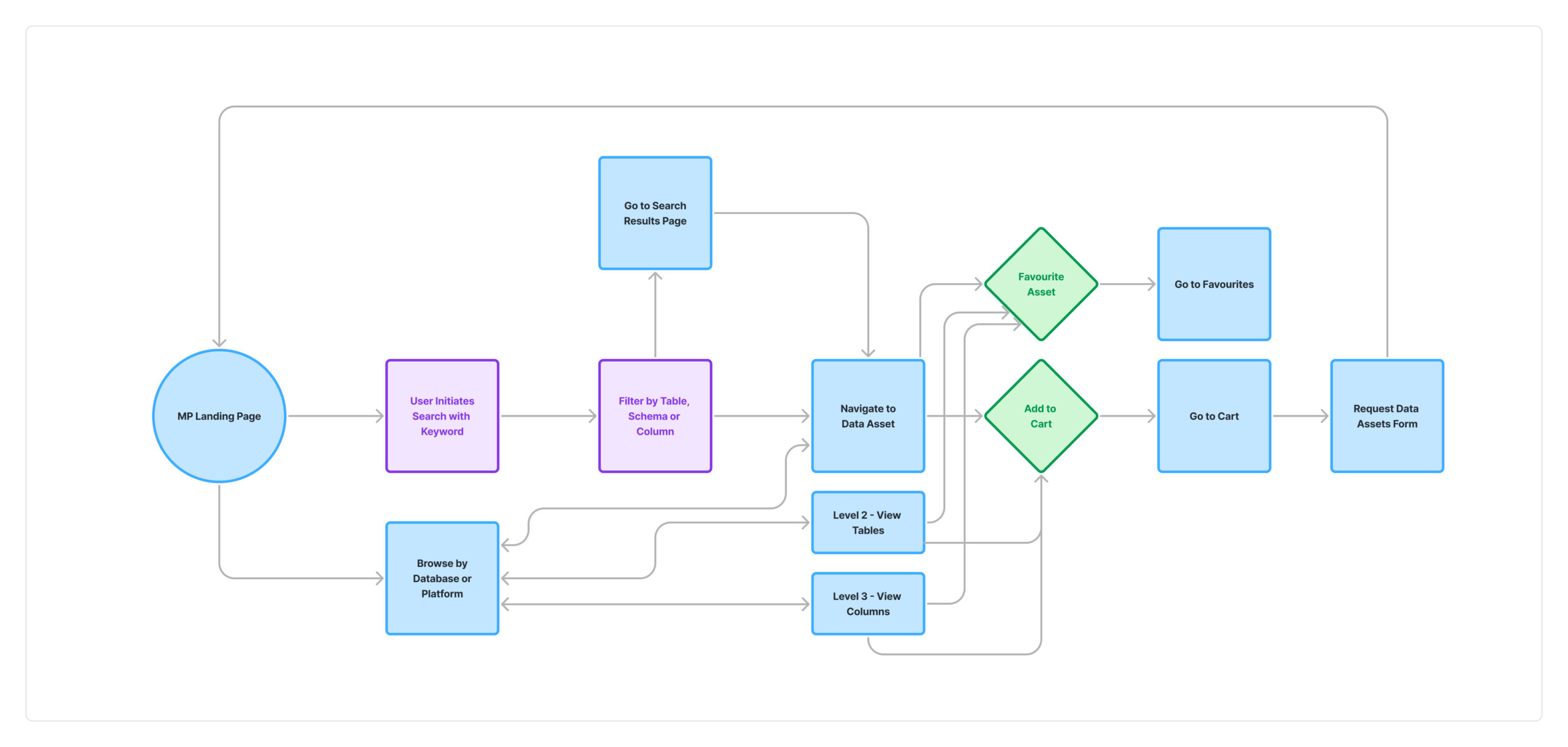
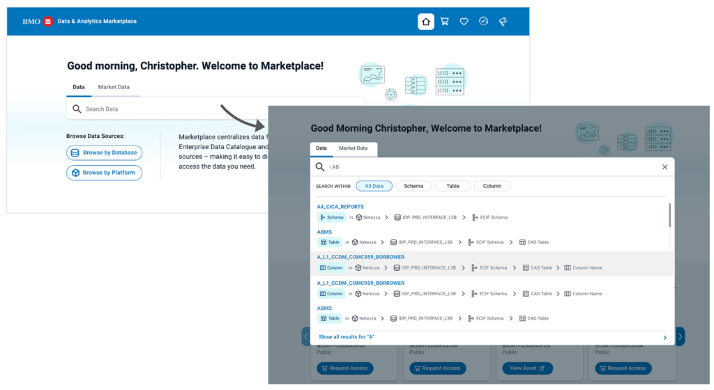
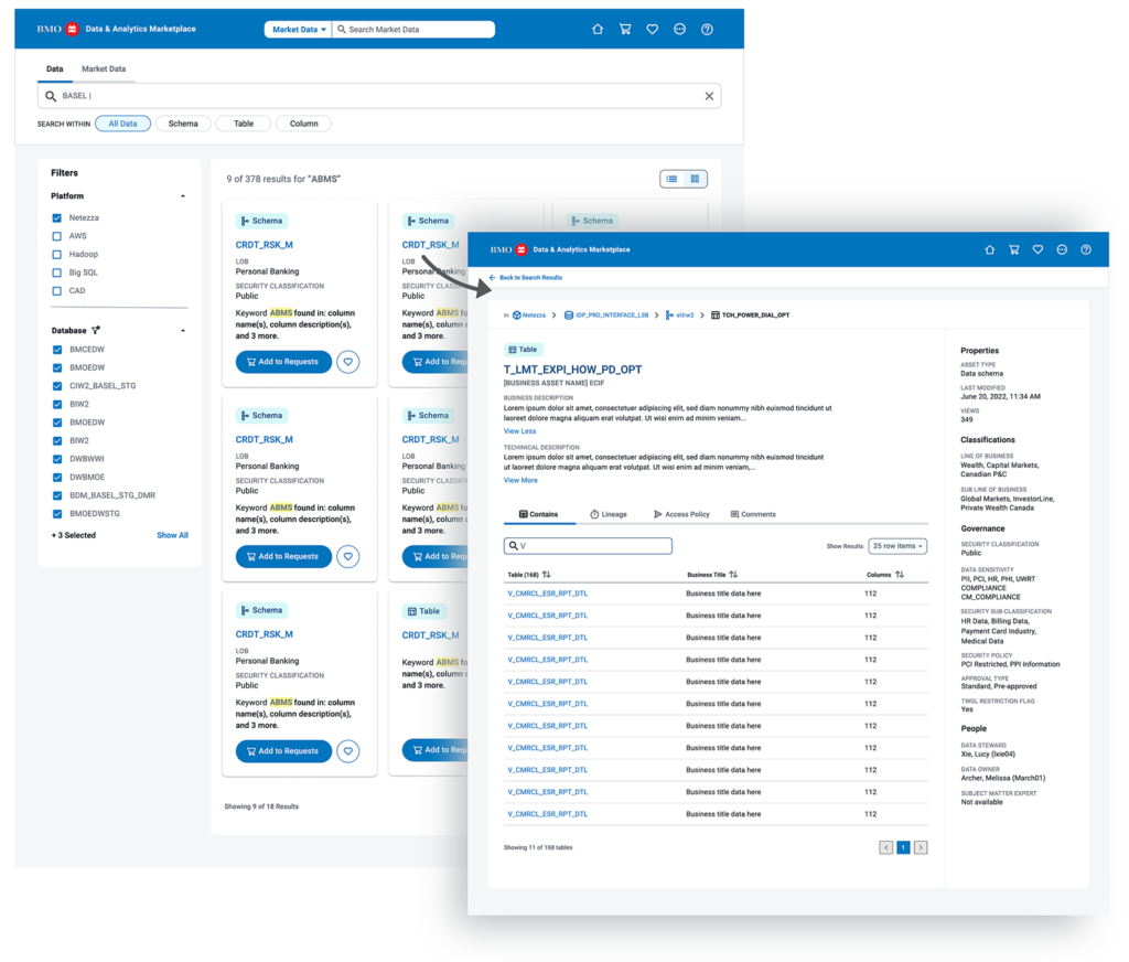
Search & Discovery Flow
I created a discovery flowchart to visualize the end-to-end process users follow when searching for data assets. This flowchart mapped key decision points, pain areas, and tool interactions, helping stakeholders understand the complexity of the current experience. It became a foundational artifact for aligning cross-functional teams, identifying gaps in the search and validation process, and prioritizing improvements in the product roadmap
Search Experience Screens
These UI/UX designs represent our initial concept for the search experience. Finalizing the user flow gave us greater clarity on what to build first and which features to prioritize.
02 Bringing the Landing Page to Life
The Process:
In the ideation phase for the Marketplace landing page, I collaborated with the team to brainstorm ideas, develop the layout, design, and content, and create detailed sketches.
I defined the page’s purpose, crafted clear messaging, selected visuals, and added call-to-action elements, all while prioritizing a seamless, user-friendly experience that aligns with the brand and drives conversions.
Low-Fidelity Sketches
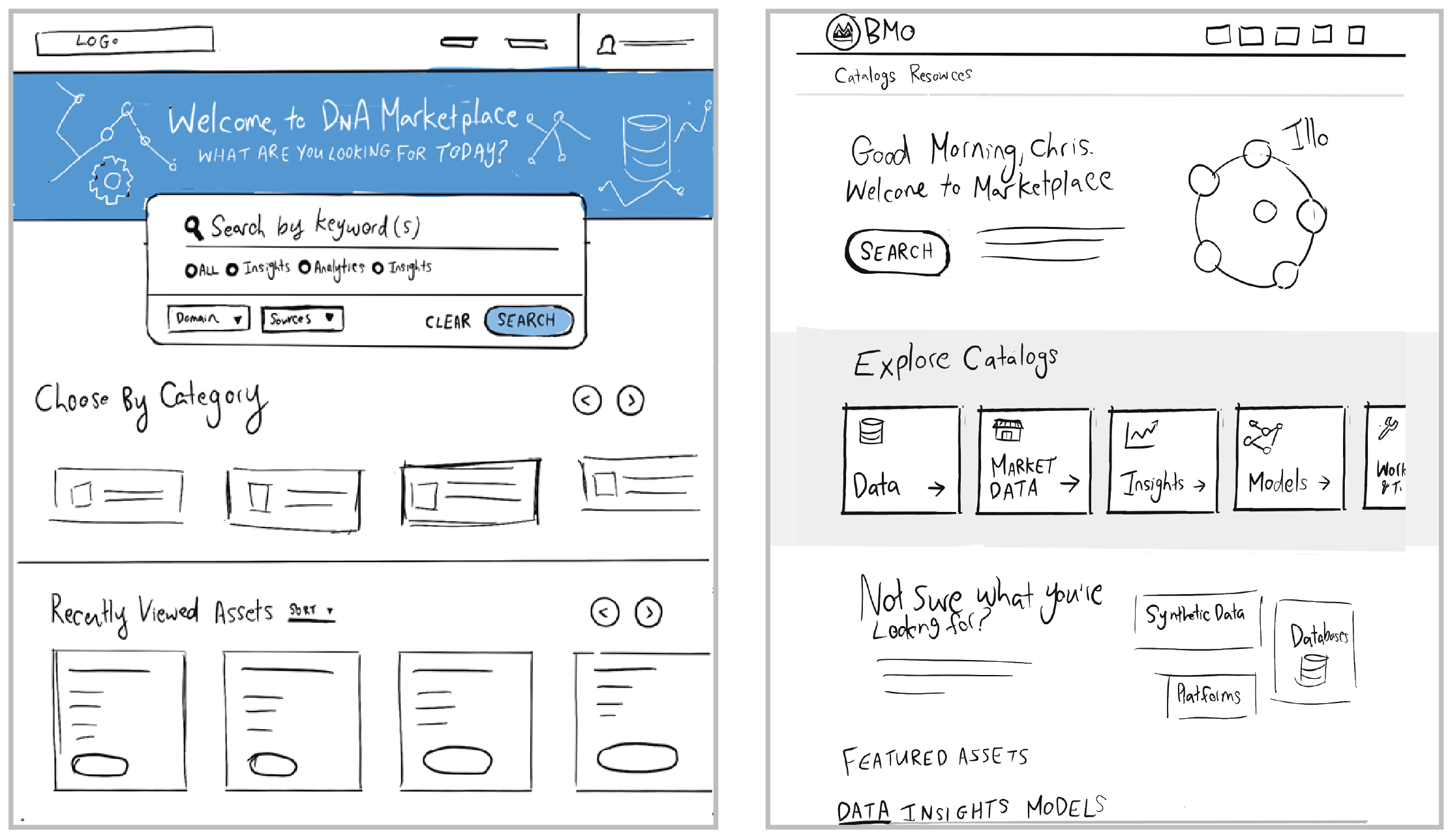
Low-Fidelity Sketches
Wireframe Concepts:
After the sketching phase, I refined our strongest visual directions and began the design process. These two directions provided a clear visual framework to define the page’s structure, layout, and functionality.
The wireframes brought greater clarity to the team, enabling us to align on the design direction before incorporating visual elements such as color and styles. This initial view allowed us to prioritize functionality, ensuring we met user needs and set a solid foundation for the next stages of the process
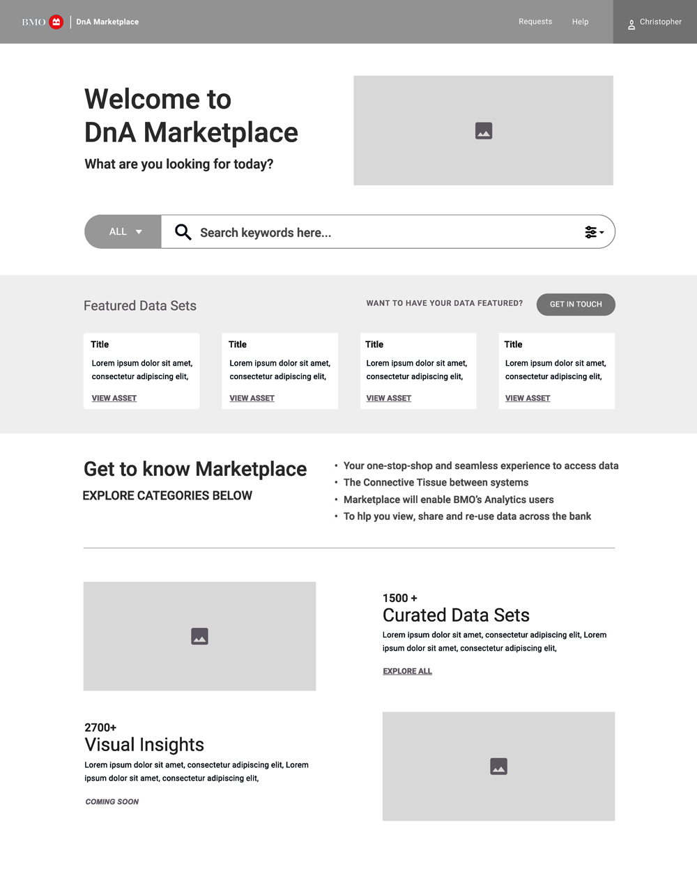
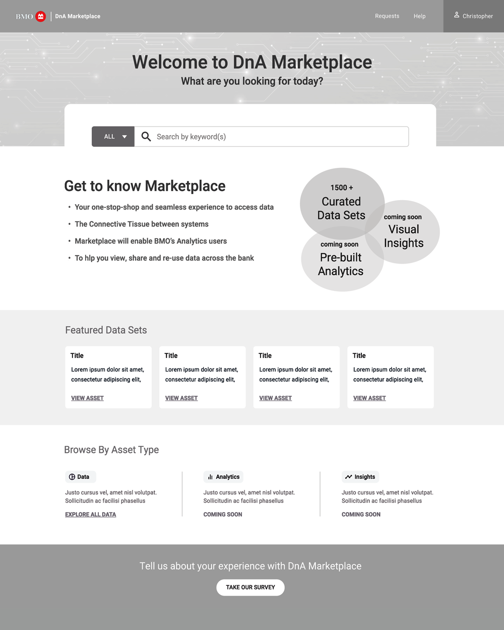
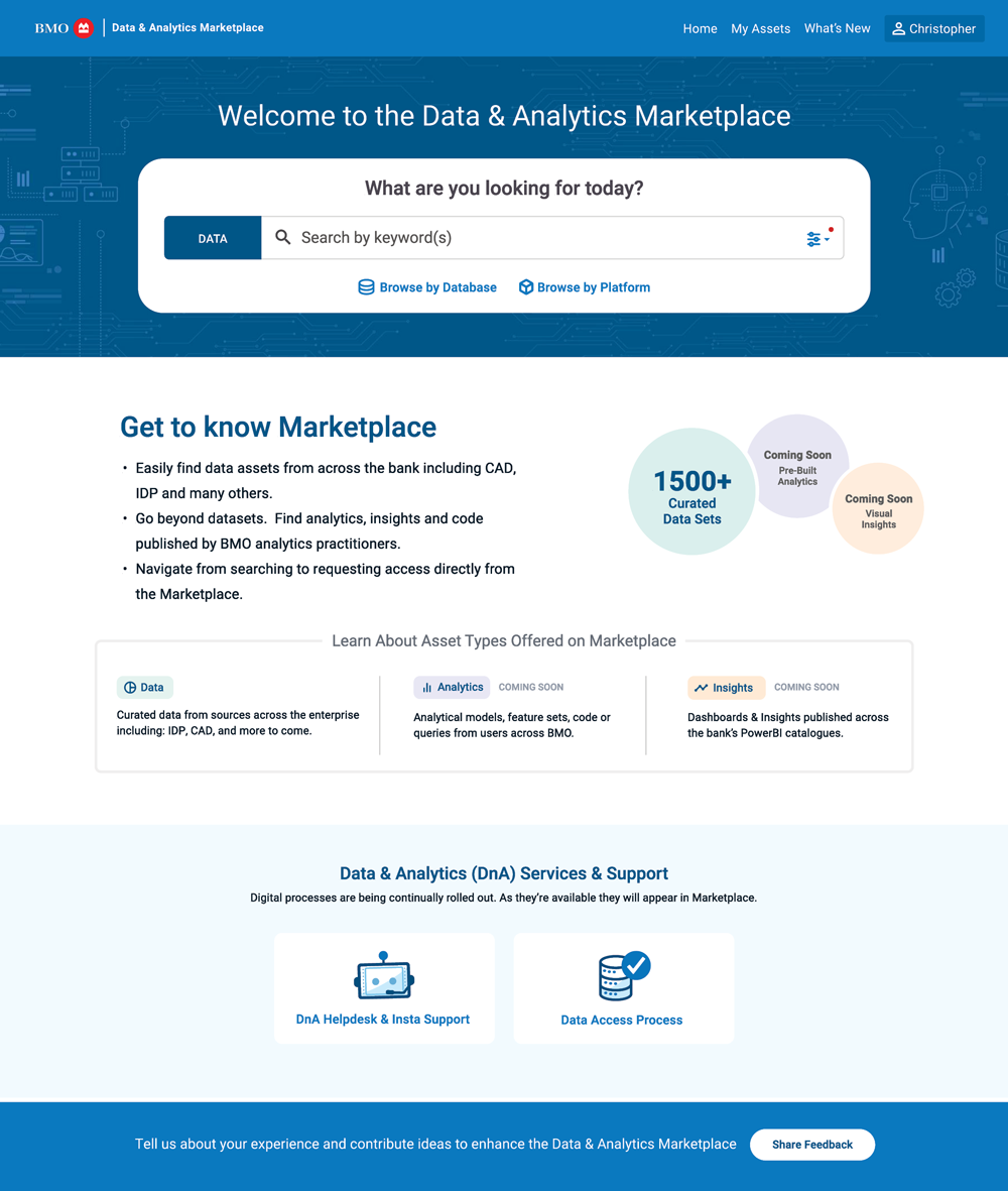
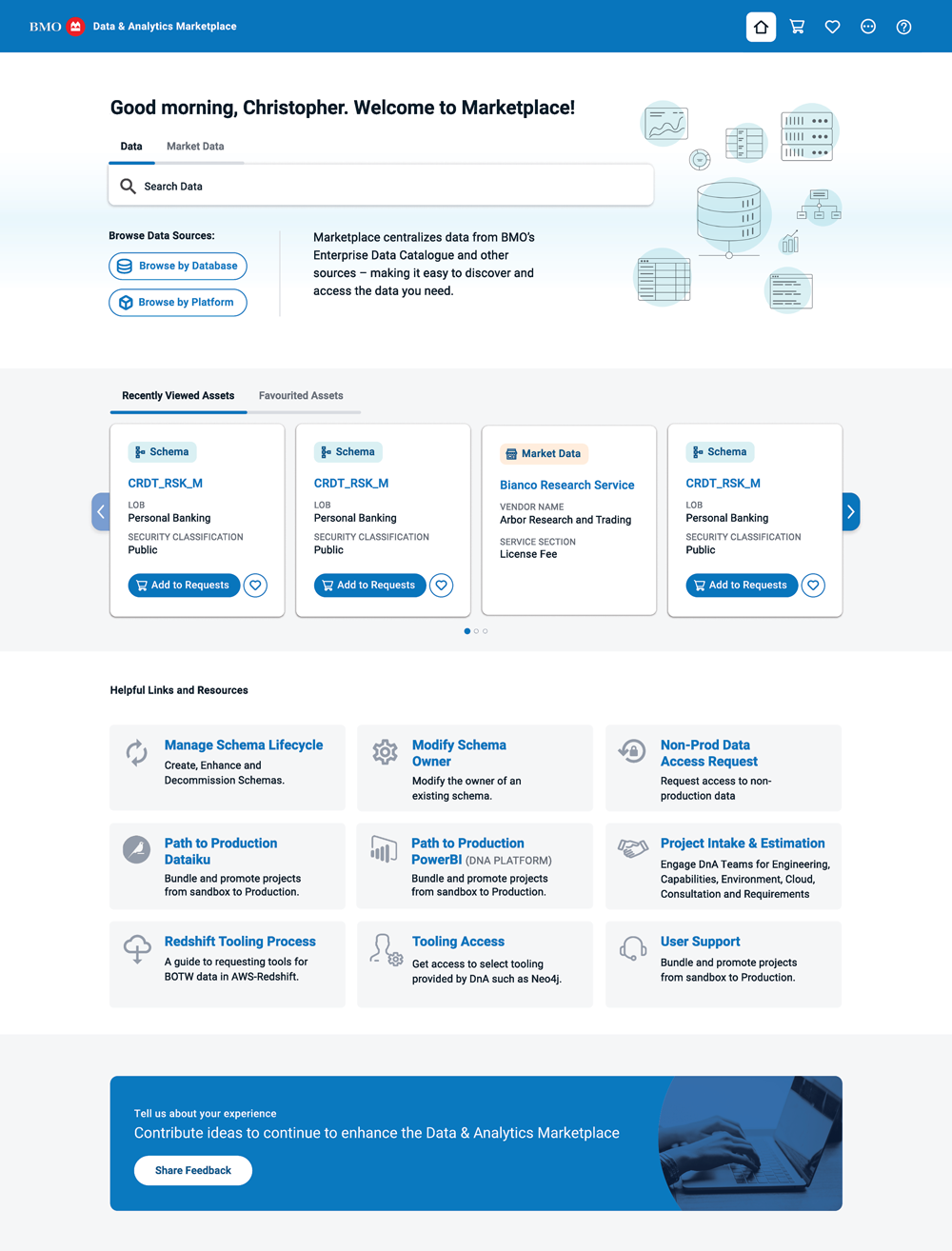
Landing Page Designs:
The landing page evolved through several iterations as we gathered ongoing insights into user behavior. What began as a general entry point shifted toward a more personalized and efficient experience.
Across multiple design sprints, we introduced tailored search, quick access to recently viewed and favourited assets, and richer contextual links to reduce friction and improve engagement.
Throughout, I stayed adaptable—responding to feedback, aligning with changing product needs, and continuously refining the design to better serve users.
What We Learned
- Users valued personalization and quick access to their most-used content.
- Recently viewed and favourited items increased engagement and task efficiency.
- Clear navigation and contextual links reduced the need for external help or repeated searches.
- Iterative feedback loops during design sprints allowed us to validate ideas early and adjust quickly.
Landing page launched with MVP
Landing Page Version 2 – More customization
03 Favouriting Experience
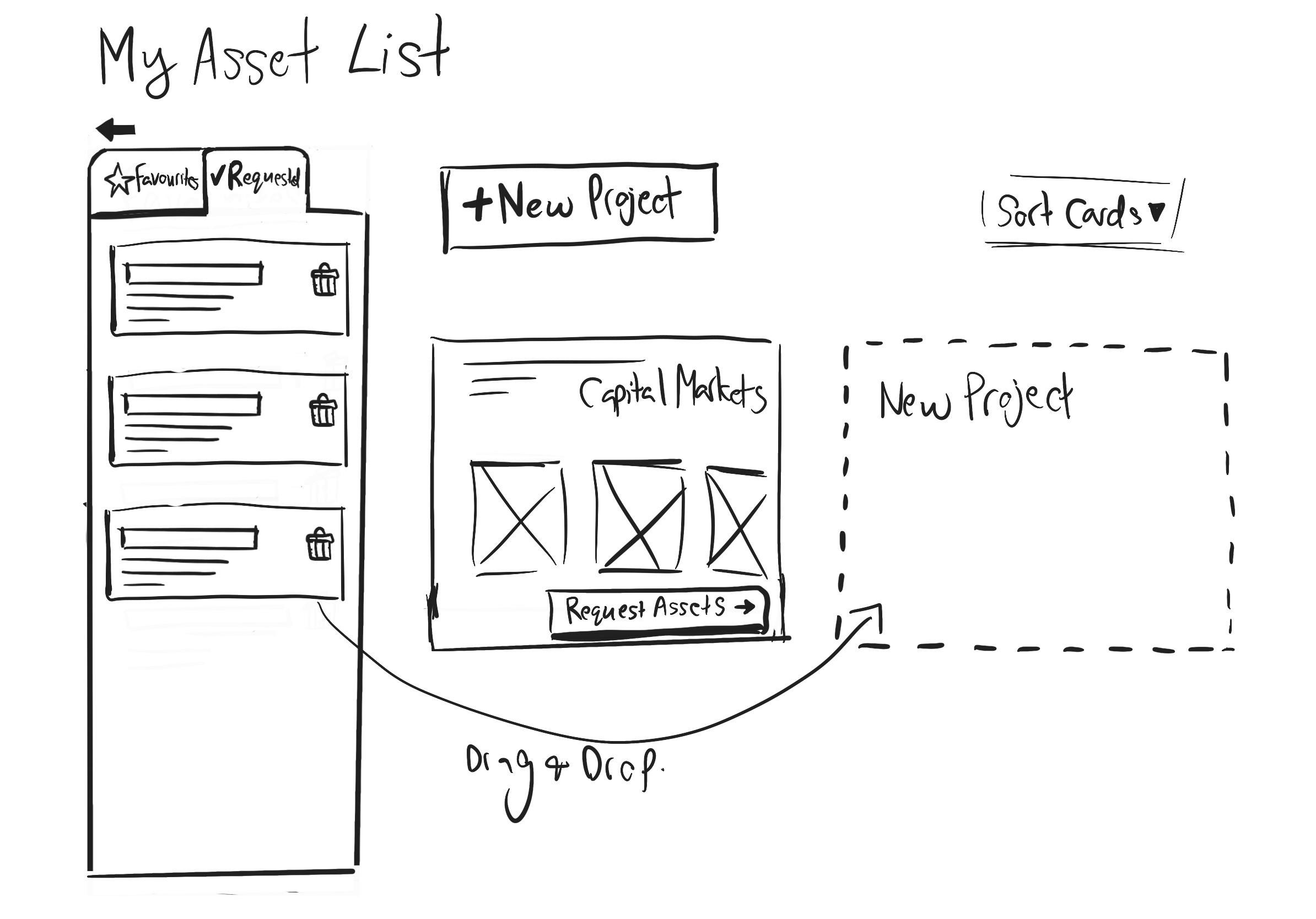
Business Goals
We identified that users would benefit from a favouriting feature to help them easily return to frequently accessed items. This small but meaningful addition aimed to improve efficiency, reduce repetitive searching, and create a more personalized experience. It also offered an opportunity to gather insights into user preferences, helping inform future product decisions based on what users value most.
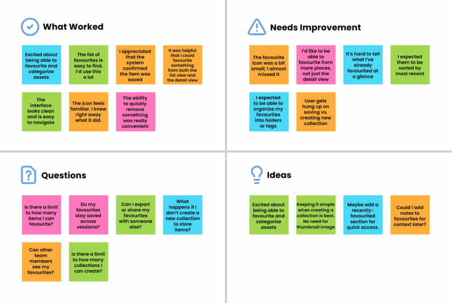
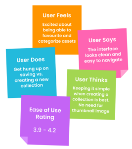
Usability Testing
To validate the design, I conducted usability testing sessions with targeted users. Participants interacted with a clickable prototype and completed tasks involving saving and retrieving favourite items. The sessions confirmed that users found the feature intuitive and helpful—particularly for reducing time spent searching for frequently used content. Feedback also surfaced minor improvements around visibility and labeling, which we addressed in the final design. Overall, the testing validated that the favouriting feature met a real user need and fit seamlessly into their workflow.
Business Goals
We identified that users would benefit from a favouriting feature to help them easily return to frequently accessed items. This small but meaningful addition aimed to improve efficiency, reduce repetitive searching, and create a more personalized experience. It also offered an opportunity to gather insights into user preferences, helping inform future product decisions based on what users value most.
Usability Testing
To validate the design, I conducted usability testing sessions with targeted users. Participants interacted with a clickable prototype and completed tasks involving saving and retrieving favourite items. The sessions confirmed that users found the feature intuitive and helpful—particularly for reducing time spent searching for frequently used content. Feedback also surfaced minor improvements around visibility and labeling, which we addressed in the final design. Overall, the testing validated that the favouriting feature met a real user need and fit seamlessly into their workflow.
Clickable Prototype
User session notes
04 Chatbot UI
Overview:
Let’s enhance the Marketplace landing page by integrating an interactive chatbot experience at the bottom, allowing users to quickly access the critical information they need. Collaborating with the Data Science team behind the model, I developed a clickable, interactive prototype to validate user engagement and secure stakeholder buy-in.
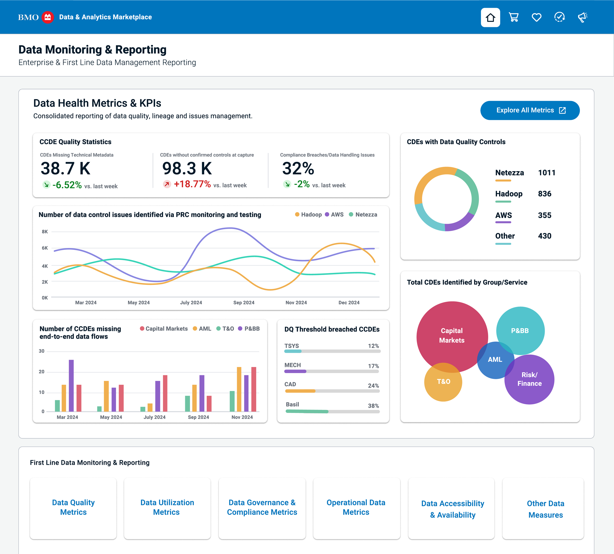
05 Data Health Dashboard
Overview:
I was tasked with bringing to life a Data Health Dashboard designed to help leadership monitor and report on key Metrics and KPIs related to Data Quality across the department. The goal was to provide a high-level overview of data health, with built-in functionality to drill down into specific areas for more detailed insights.